Andalusi
Andalusi is an Arabic-first design app — templates, typography, photo and video tools for people who create in Arabic and English.
When iOS 26 announced Liquid Glass, our design system was already moving in the same direction: edge-to-edge layouts, less chrome, more content. The refresh was a chance to adopt the platform properly, not retrofit it.
| Year | 2025 |
| Role | Senior Product Designer |
| Platform | iOS / iPadOS |
| Focus | Liquid Glass adoption, hierarchy, motion, system migration |
| Website | https://andalusi.app |
The real question
Liquid Glass is designed for content-led apps where UI can fade back. A creator app is almost the opposite — busy templates, high-contrast photos, dense Arabic typography. So the question wasn't should we adopt it? It was:
Five decisions that shaped the refresh
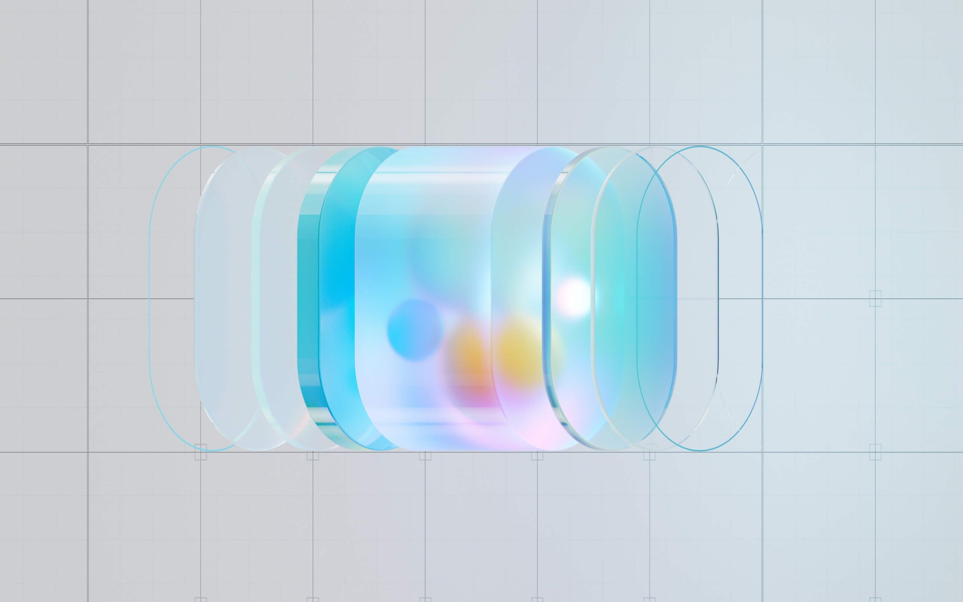
Glass as a system, not a style
Three layers — glass, selective glass, solid fallback — instead of "make everything glass."
Dock + floating Create
Pulled Create out of the tab bar so browsing and creating stop competing.
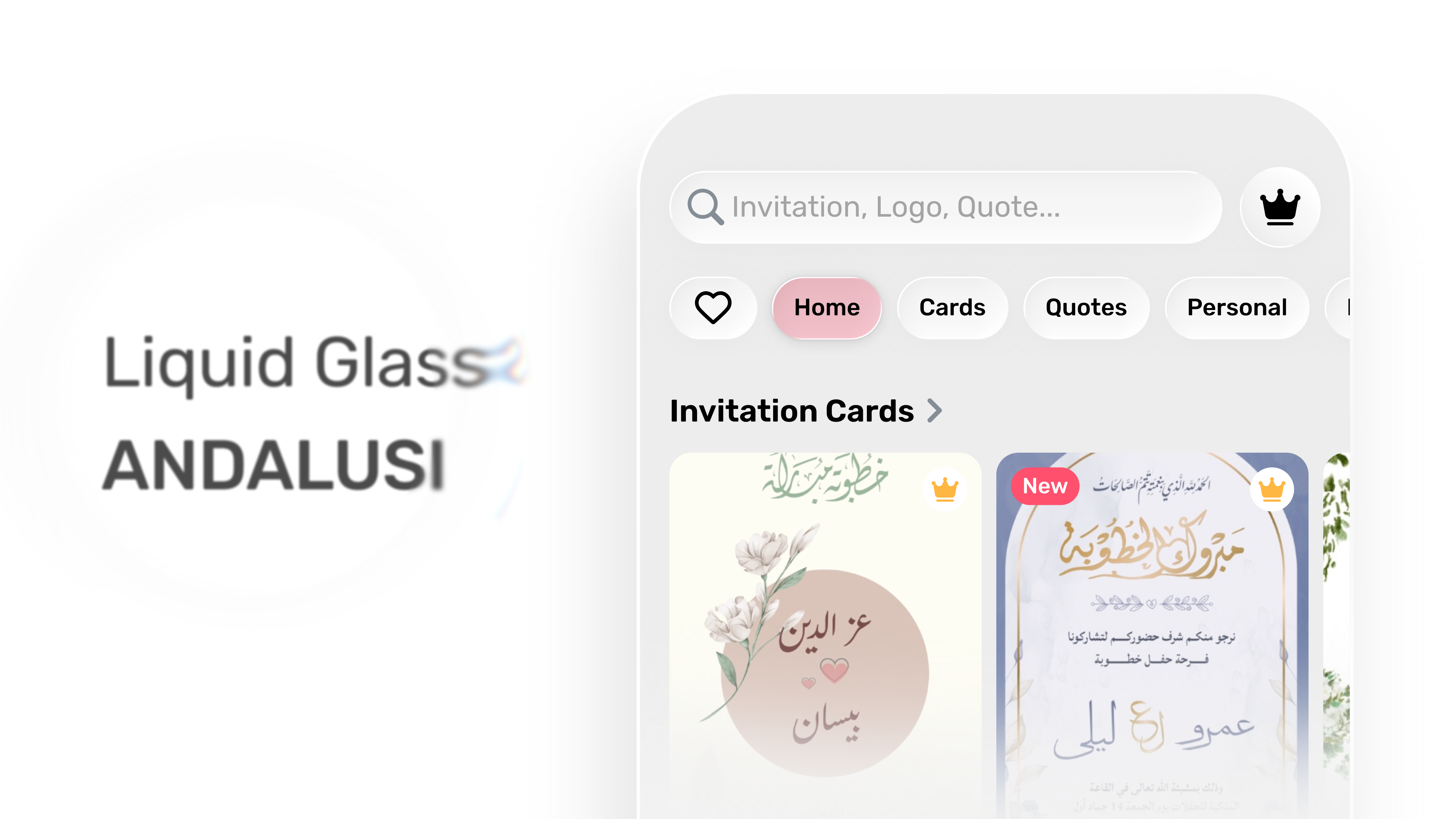
Templates header as a lens
Search and chips sit on glass; the templates stay the hero in both themes.
My Designs gets quiet
Bigger thumbnails, fewer controls, the dock floats without blocking content.
Composer as a glass utility
Prompt entry that keeps the canvas visible behind it — powerful, never heavy.
Typography wins
If glass hurts Arabic legibility, glass loses. Always.
Principles
- 01Content leads. Templates and canvas are the hero.
- 02Navigation is glass. Create and discovery should feel light.
- 03Typography is sacred. If glass hurts legibility, glass loses.
- 04Native-first. Don't rebuild what iOS already provides.
- 05Calm motion. Transitions explain hierarchy, not distract.
Material model
I treated Liquid Glass as a layered system, not a finish:
Glass surfaces
Navigation, browsing, lightweight actions.
Selective glass
Editor moments where contrast stays safe.
Solid fallback
Busy backgrounds and accessibility cases.
A predictable rule set — and a hedge against glass-everywhere.
What I designed
Navigation
Dock + floating Create
Create used to live inside the tab bar and competed with navigation. I split the responsibilities:
Discovery
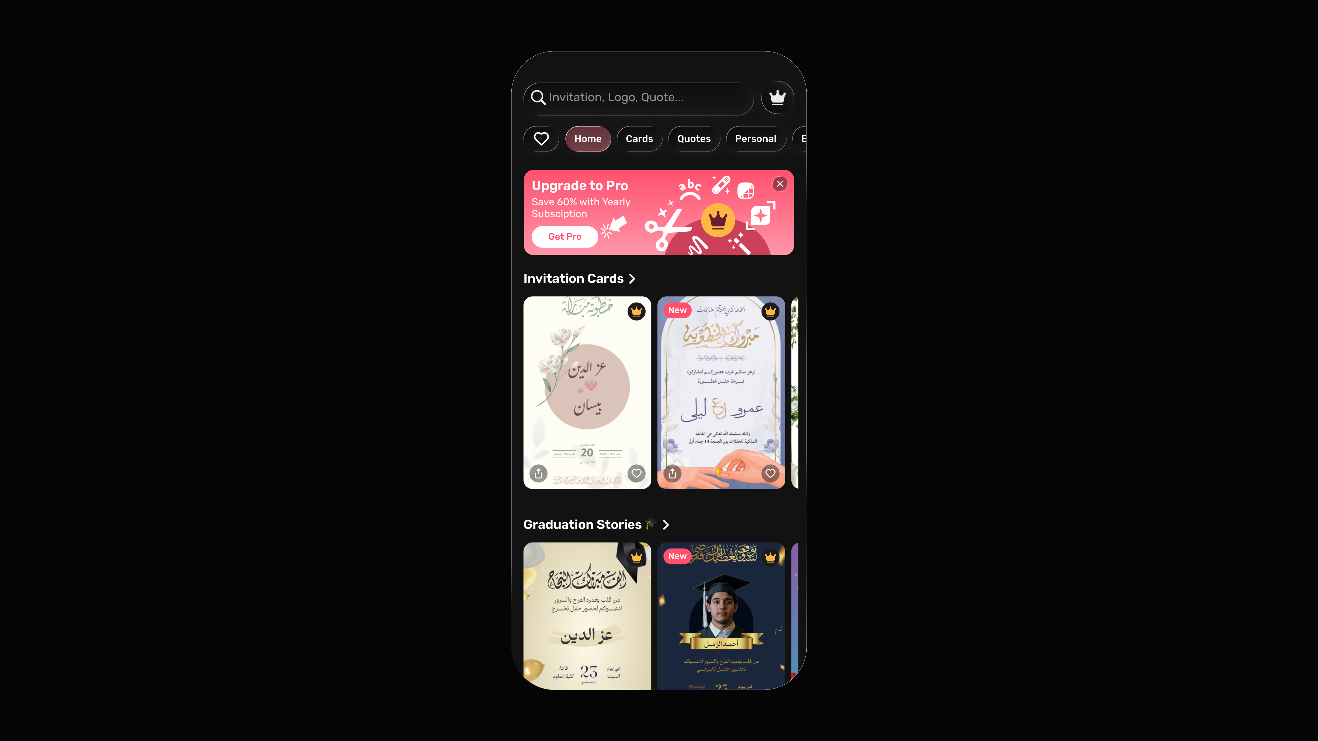
Templates header (Light/Dark)
Templates are visual, so the UI should feel like a lens, not a frame. A glass header stack that stays readable across themes:
- Search inside a soft glass field.
- Category chips as pill controls with subtle elevation.
- Premium entry available, but never dominating the page.
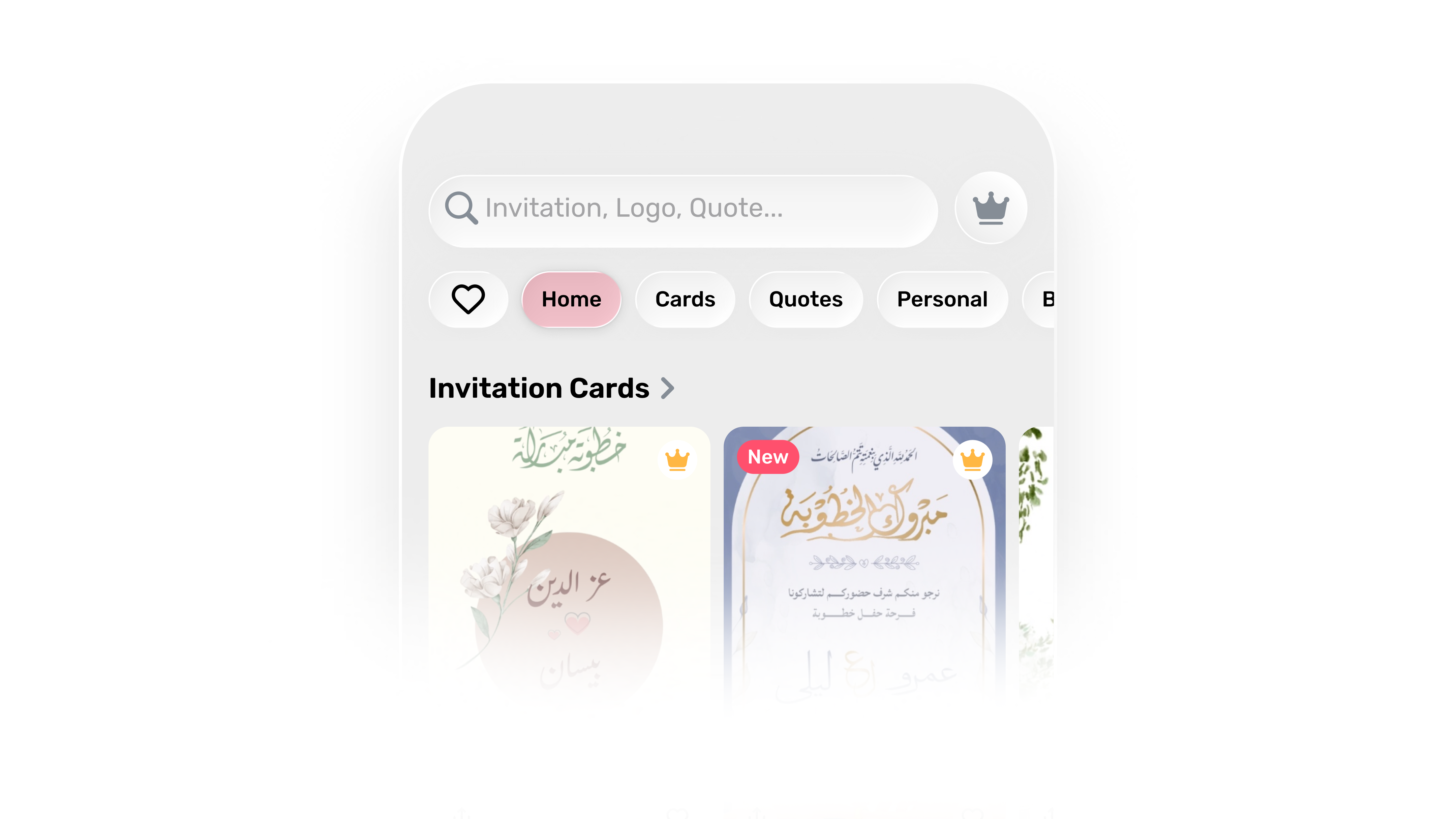 Light Mode
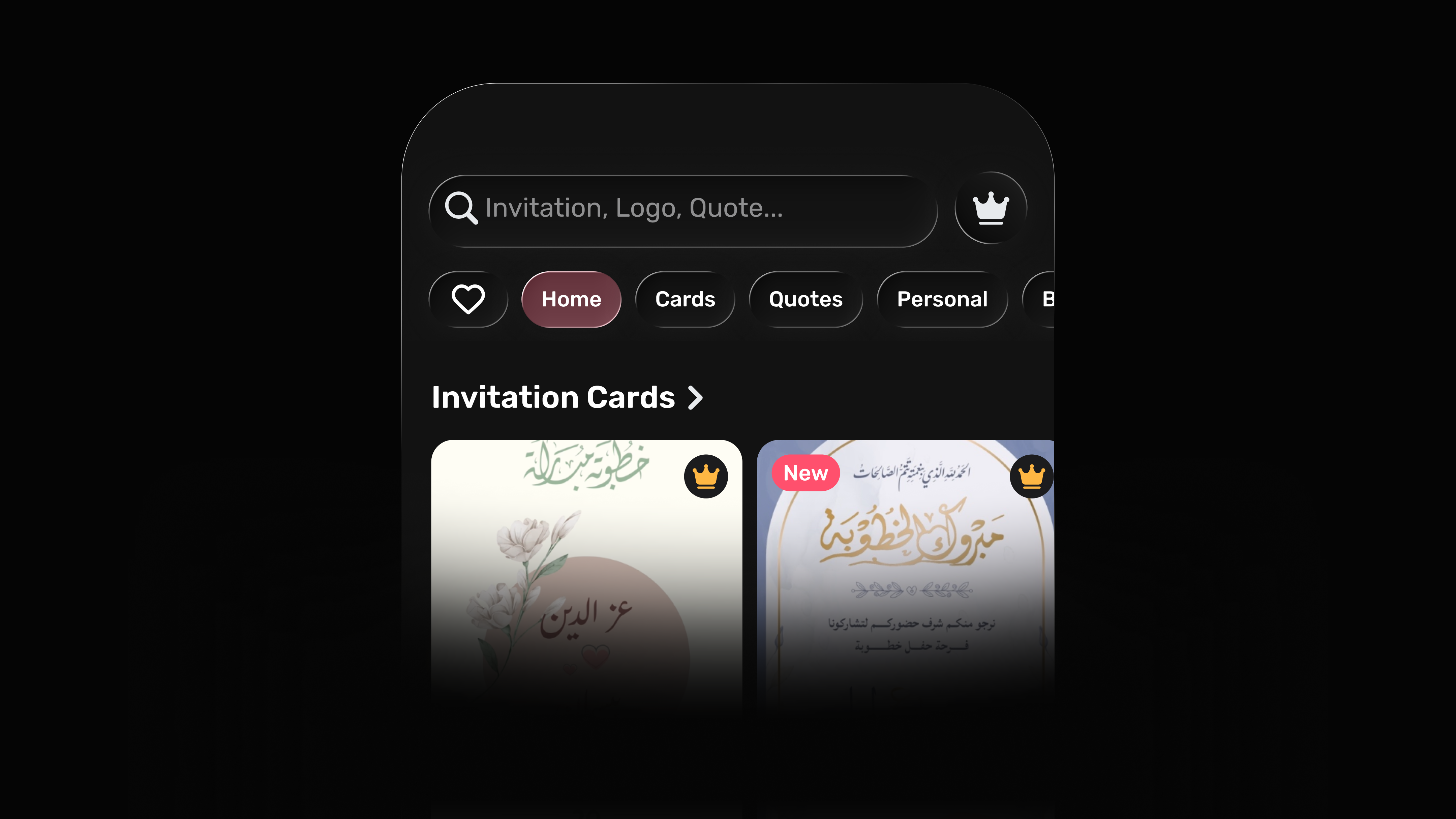 Dark Mode
Library
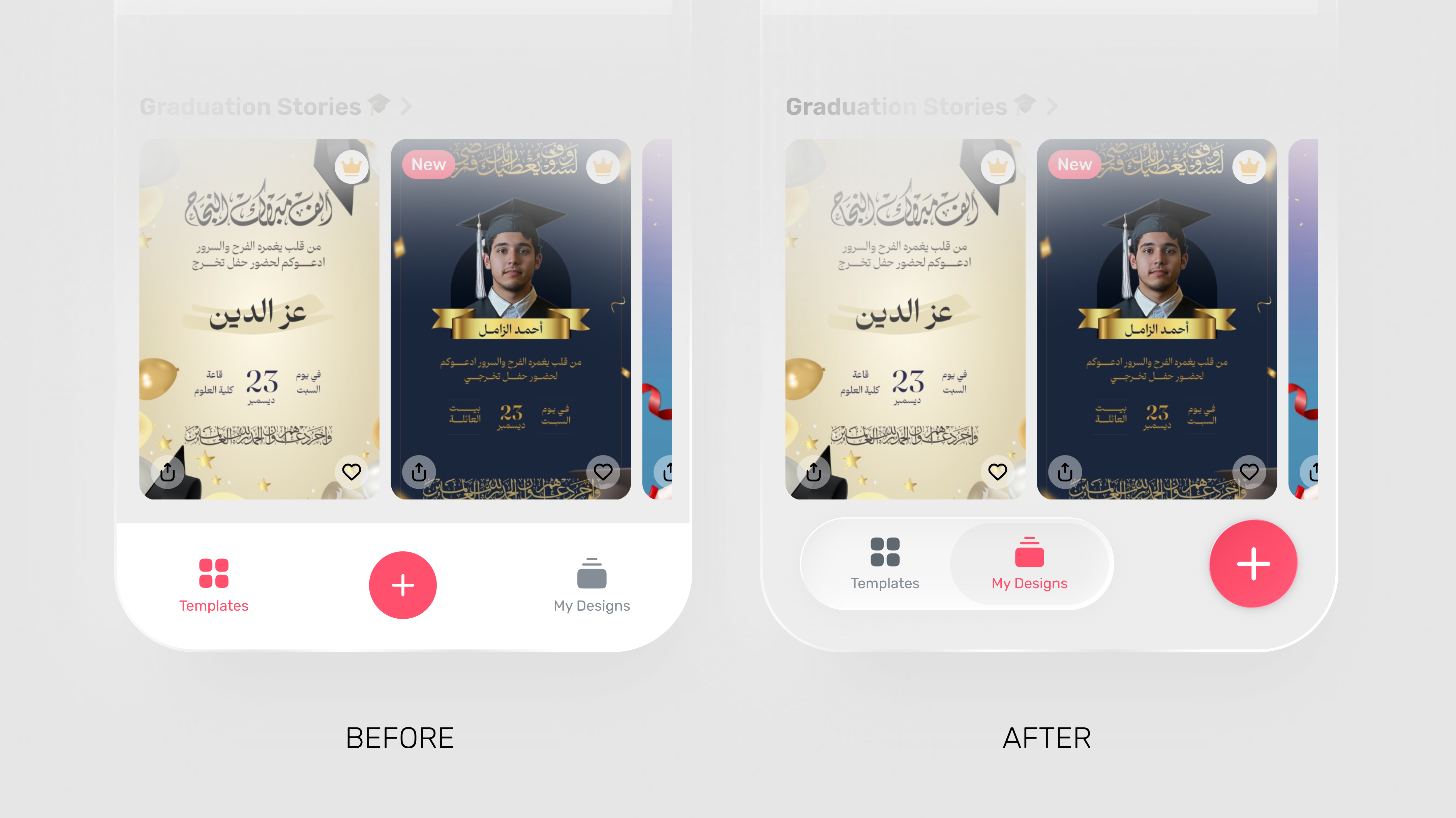
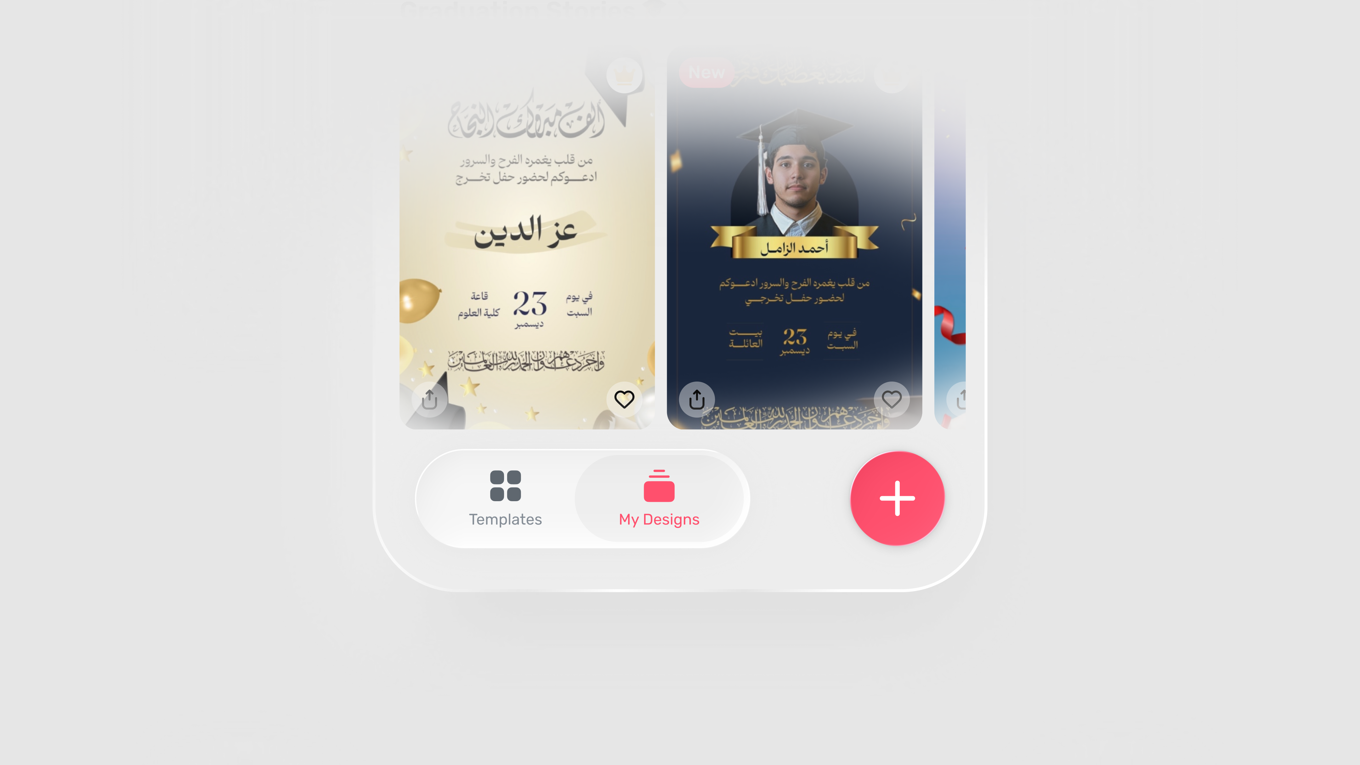
My Designs (Light/Dark)
My Designs is where users come back to continue work, so it has to feel quiet and fast to scan.
- Larger thumbnails for quick recognition.
- Minimal header controls — just enough.
- Dock and Create float without blocking content.
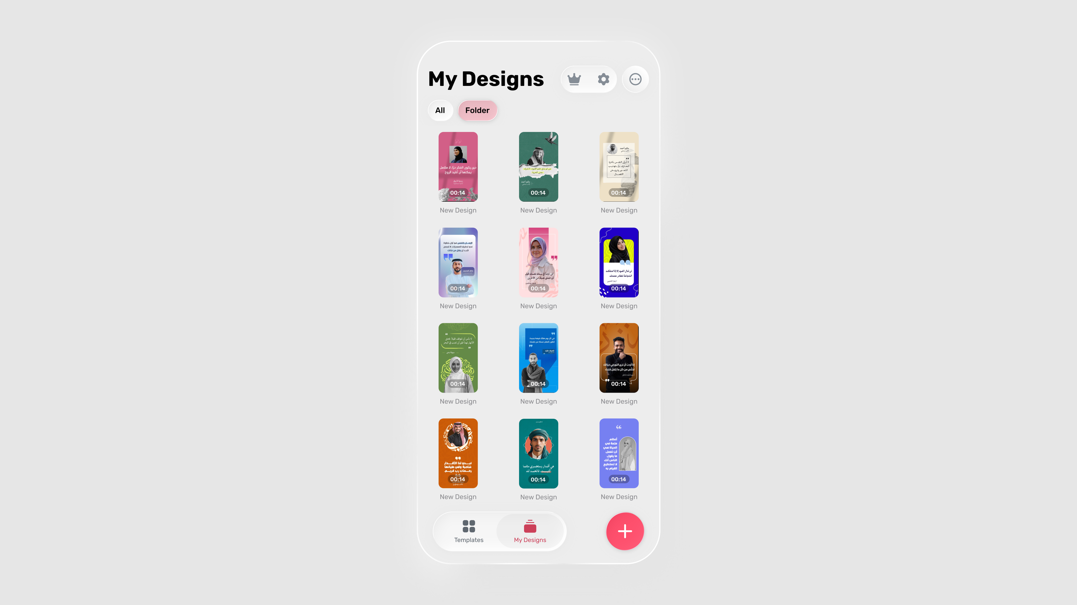 Light Mode
 Dark Mode
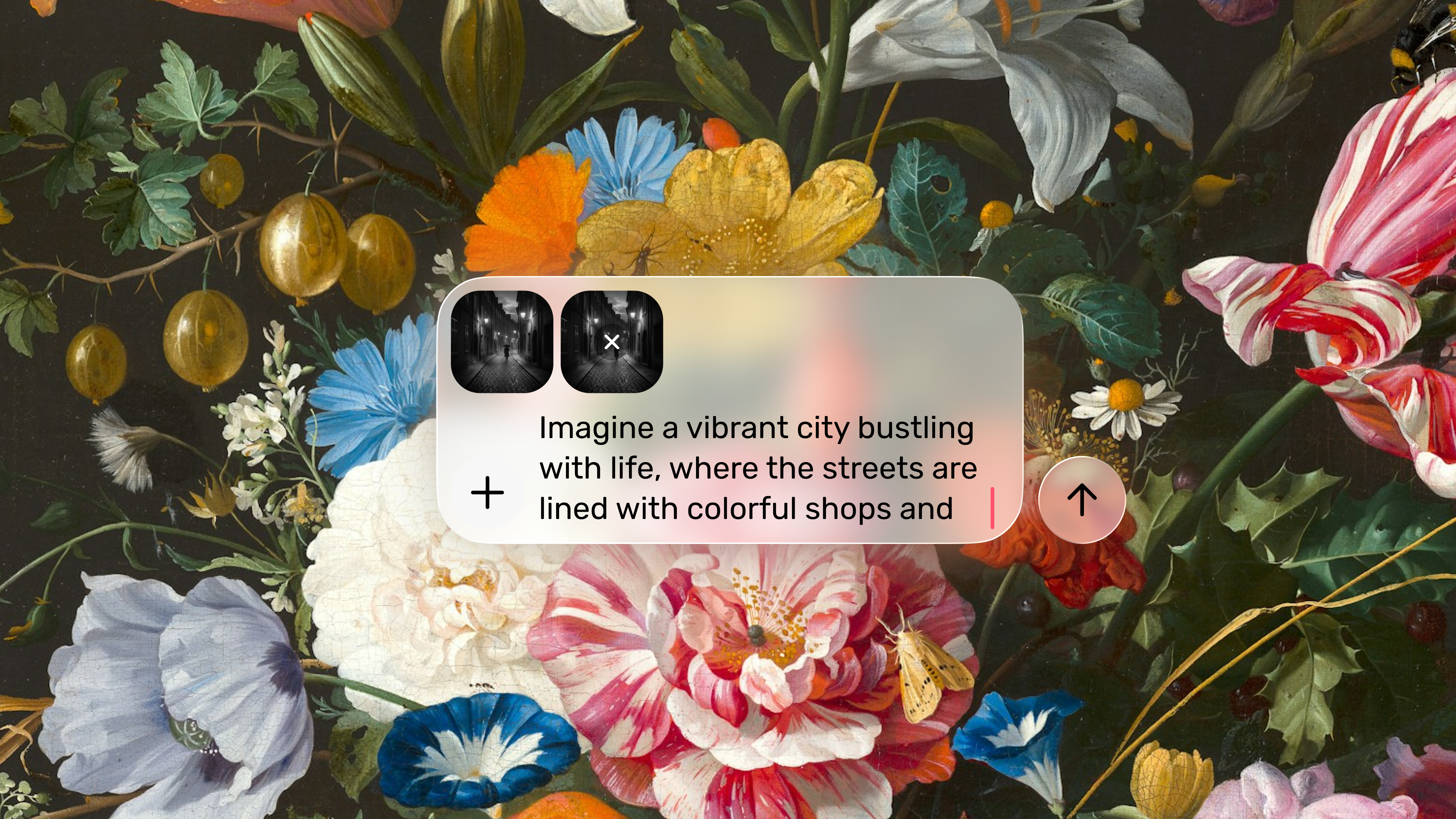
AI
Prompt composer
As AI editing entered the editor, we needed a pattern that felt powerful without adding weight. The composer behaves like a glass utility:
- Inputs as thumbnails with an add affordance.
- Typing stays focused and comfortable.
- Content behind the surface stays visible, preserving context.
Micro-interactions
Liquid Glass is behavior as much as visuals. Motion stays calm and explanatory.
What shipped
Templates discovery header
Search, category chips, and premium entry aligned to Liquid Glass.
Redesigned bottom nav
Glass dock with a floating Create that owns its own intent.
My Designs · Light + Dark
Consistent materials across themes, quieter chrome, larger thumbnails.
AI composer pattern
A prompt surface future editor AI features plug into.
Impact
UI steps back
Content steps forward. The app reads as more immersive without losing affordance.
Create has its own weight
No longer a confusing tab — a primary action with its own surface.
One material rule set
Glass / selective glass / solid fallback scales to future surfaces.
Learnings
- 01Ship the foundation, then iterate. The first release doesn't have to be perfect — it has to be coherent.
- 02Build with the platform. Native components reduce complexity and feel better.
- 03Typography is the UX. In Arabic-first products, readability comes before everything else.
- 04Glass is a material system. Not a visual effect to sprinkle on top.