Marketing Planet
A marketing agency site that read like a principles document — every right-sounding statement but no obvious next step. The redesign turned a services catalog into a productized funnel built around one action: book a strategy call.
| Year | 2025 |
| Role | Product Design Consultant & Lead |
| Collaborators | Saman S. (Founder), Marketing Planet Team |
| Website | marketingplanet.global |
The real question
The previous site listed everything the agency could do. That's not the same as helping a visitor decide. The brief was clear:
Everything else — packaging, proof, attribution — followed from that.
Four shifts that did the work
Outcome-led headline + one CTA
"Book a Free Strategy Call" becomes the dominant action. Principles move below the action, not in front of it.
Four productized packages
Launch Orbit · Scale Galaxy · Automate Cosmos · Enterprise Supernova — mapped to business maturity, not service type.
Trust early, comparison near the CTA
Recognizable logos near hero. "MP vs Generic Agency" table next to the booking action.
Attribution baked into the lead form
Referral Source field + dual-office signal (Vancouver / LA) — sales can finally measure channels properly.
Before → After
The package system
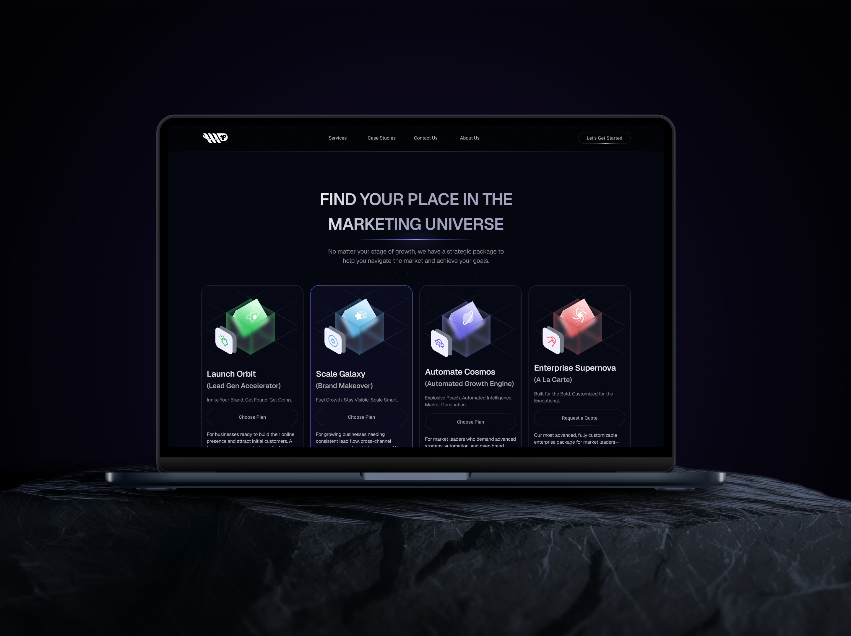
Launch Orbit · Lead Gen Accelerator
Local SEO, basic Google Ads, analytics reports, email support, monthly call.
Scale Galaxy · Brand Makeover
Multichannel SEO, Google & Meta Ads, support manager, biweekly calls, ClickUp + email.
Automate Cosmos · Growth Engine
Full SEO package, AI automation, weekly reviews, VIP manager, priority support.
Enterprise Supernova · À La Carte
Custom scope, weekly reviews, VIP manager, priority support.
Each card uses the same component shape: tier name → promise → 5 deliverables → Book a Strategy Call. Visual consistency makes the comparison effortless.
Design system
Components: Hero, TrustBar, PackageCard, CompareTable, TestimonialCard, FAQAccordion, LeadForm.
Deliverables
IA + UX copy system
Outcome-led messaging applied page-by-page.
High-fidelity responsive landing
Component library, tokens, full annotation for dev handoff.
A/B test backlog + analytics event map
Ready-to-run experiments tied to the new CTA hierarchy.