Mr. Lingo
Mr. Lingo is a gamified English learning app — built for the moment most language apps lose their users: day three, when novelty wears off and discipline hasn't kicked in yet.
| Year | 2025 |
| Role | Product Designer |
| Focus | Gamification, retention, mascot-led UX |
| Website | hamedbahadori.com |
The real question
Around 80% of language-app users churn in the first seven days. Bad UI plays a part, but the deeper failure is emotional — daily practice feels like homework, not a game.
The answer wasn't "more features." It was treating emotion as a system: mascot, rhythm, reward, recovery.
Who I designed for
The kid
Learning English to talk to his cousin in Canada. Gets bored fast. Motivated by stars, animation, and leveling up.
The adult
Career-driven. Wants short daily exercises with visible progress and gentle consistency nudges.
Five decisions that shaped the app
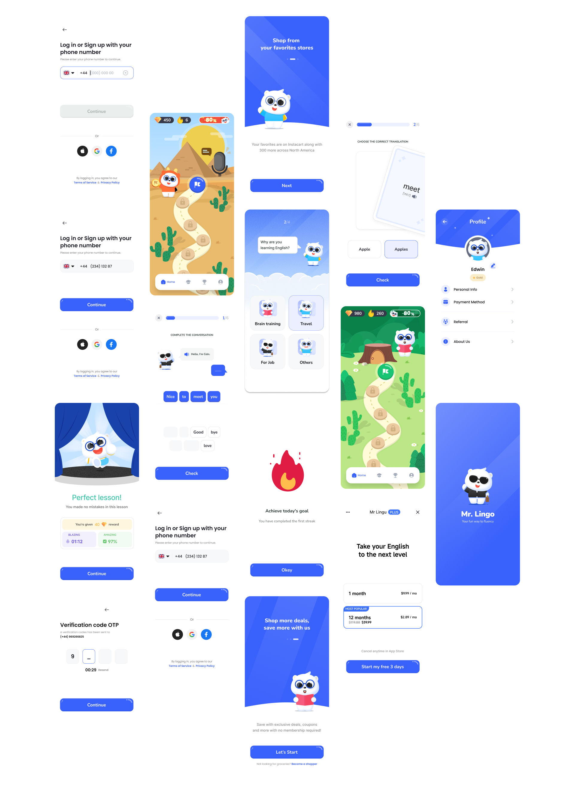
Mr. Lingo as the through-line
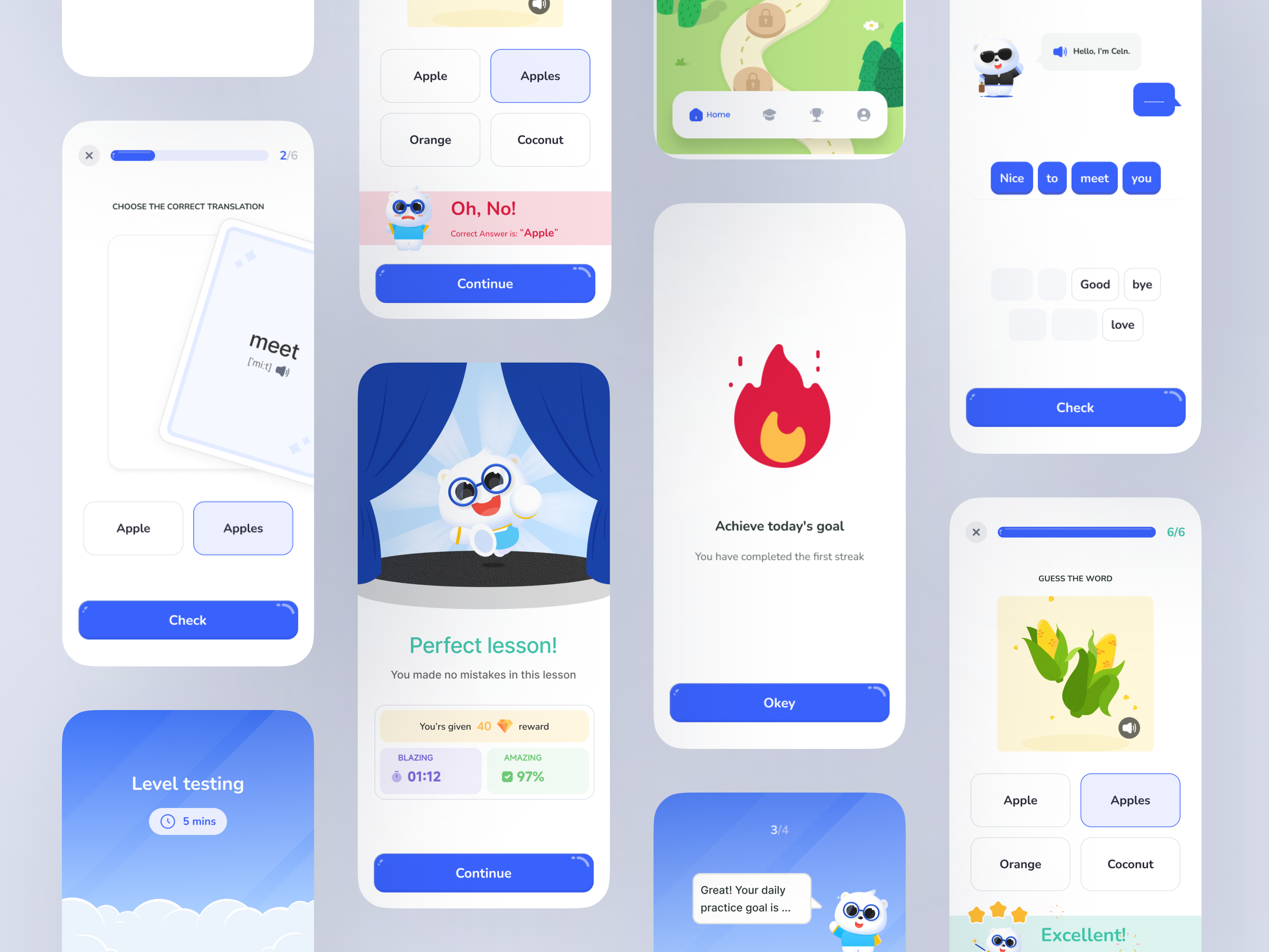
A joyful panda mascot with reactive states — the emotional anchor across onboarding, lessons, and recovery.
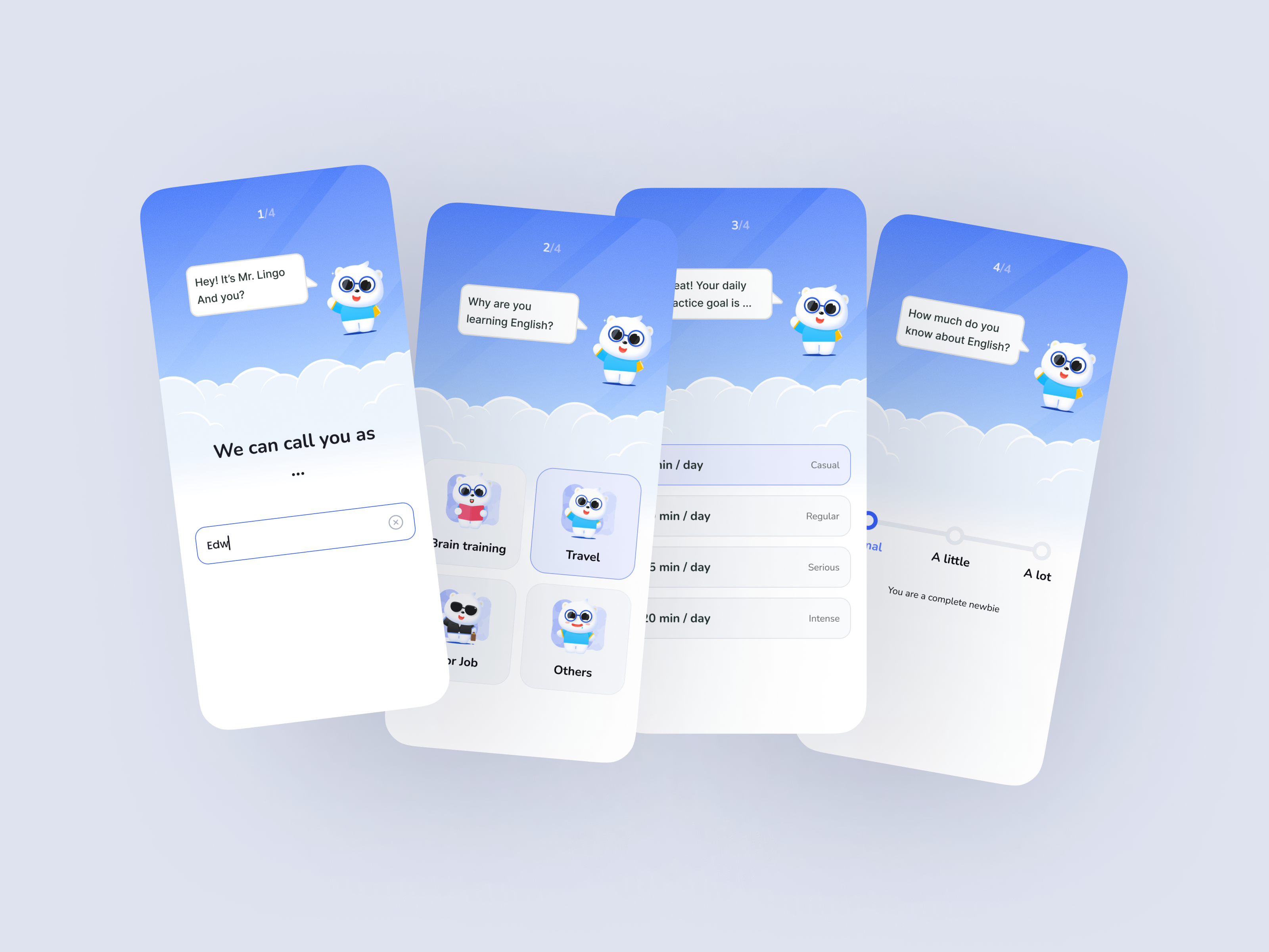
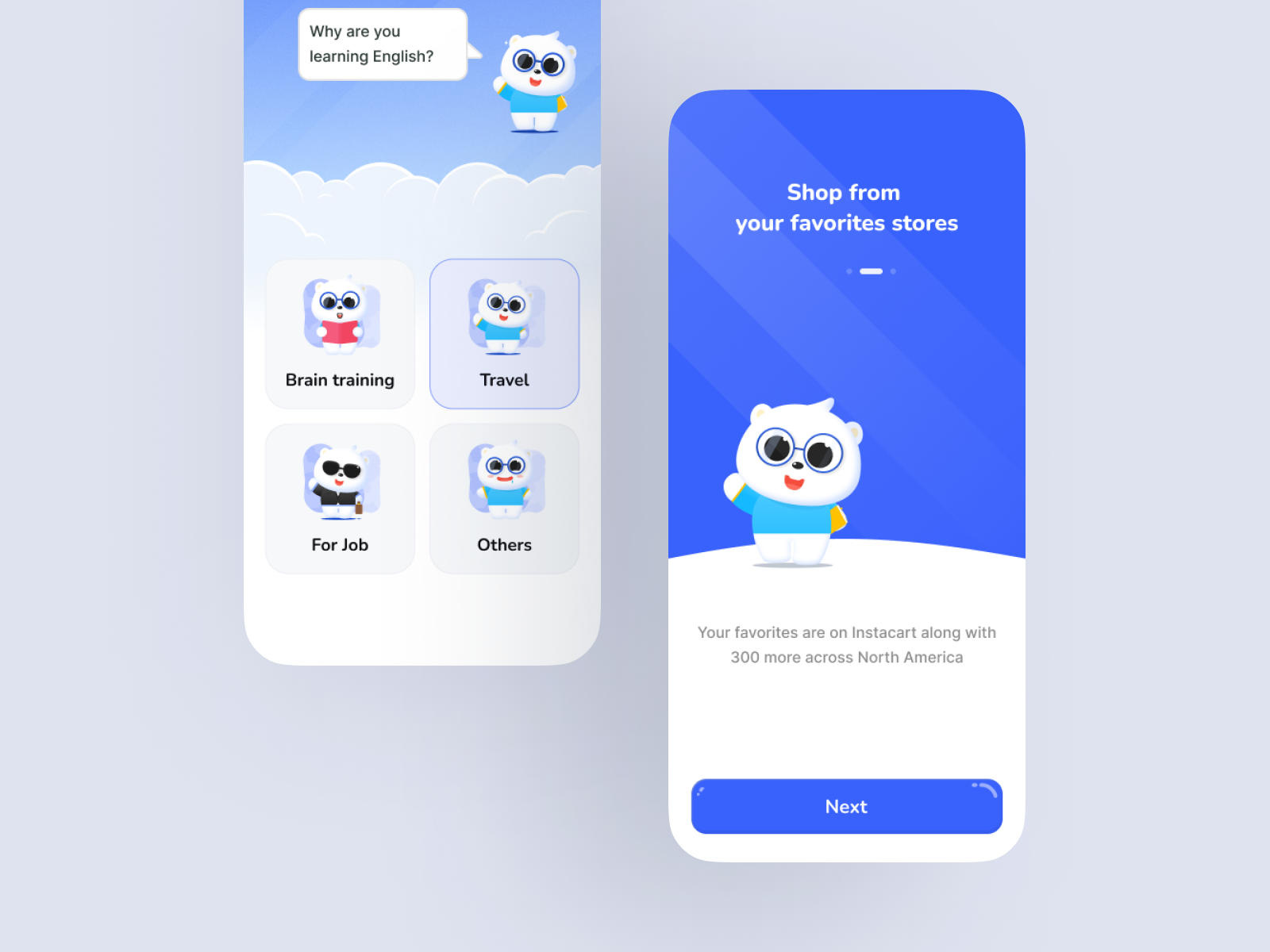
Three taps to first lesson
Name, goal, daily streak time — then learning starts. No setup wall.
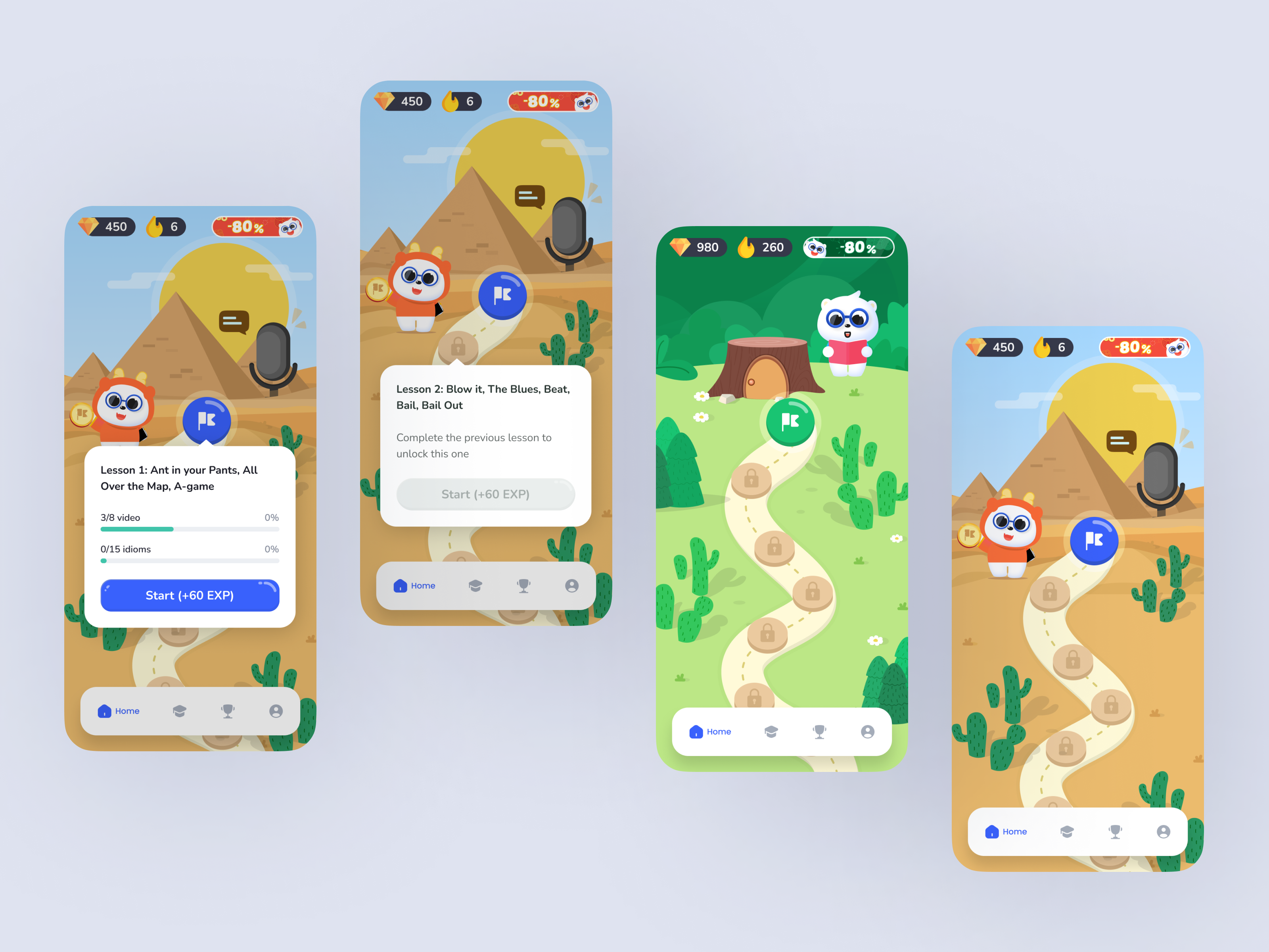
Story-driven map
Levels appear on a playful world map — forest, desert, underwater. Progress is spatial, not just numerical.
Swipeable, not tabbed
Drag-and-drop, fill-the-blank, tap-to-speak. One interaction style per screen, no menu maze.
Celebrate, don't congratulate
Fireworks and mascot reactions after lessons — felt feedback, not a "+10 XP" toast.
"I feel like I'm playing, not studying"
The line from a tester that confirmed the emotional brief had landed.
Trade-off that shaped the product
What the testing showed
4 → 8 min avg session
Doubled after the mascot landed in the lesson loop.
100% on first lesson
After simplifying the UI and enlarging kid-friendly CTAs.
Felt like play
Tester language shifted from "doing the lesson" to "playing the level."
What changed after testing: tabs became swipeable lessons, CTAs grew for younger users, and the map navigation was simplified to one tap per level.
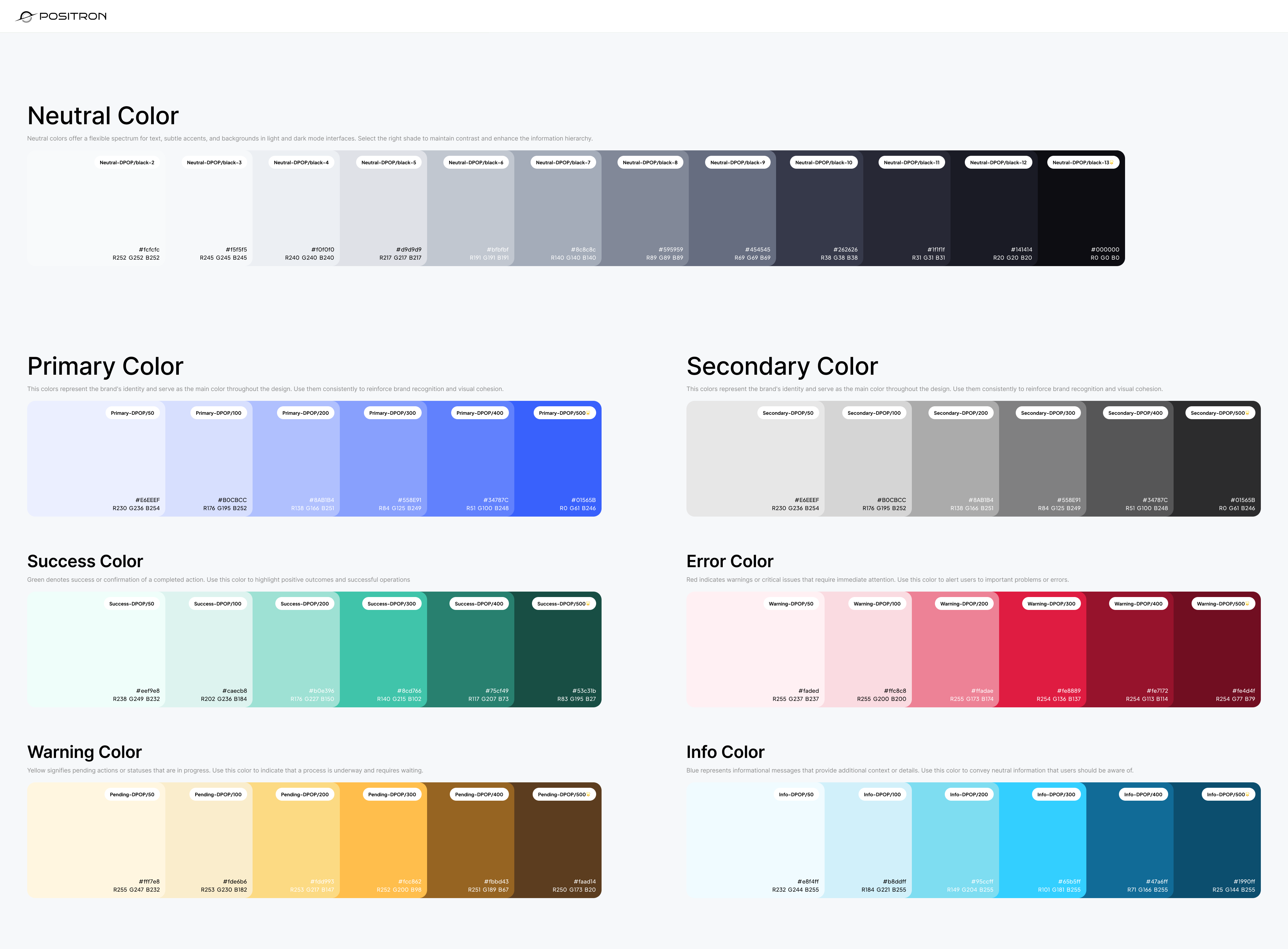
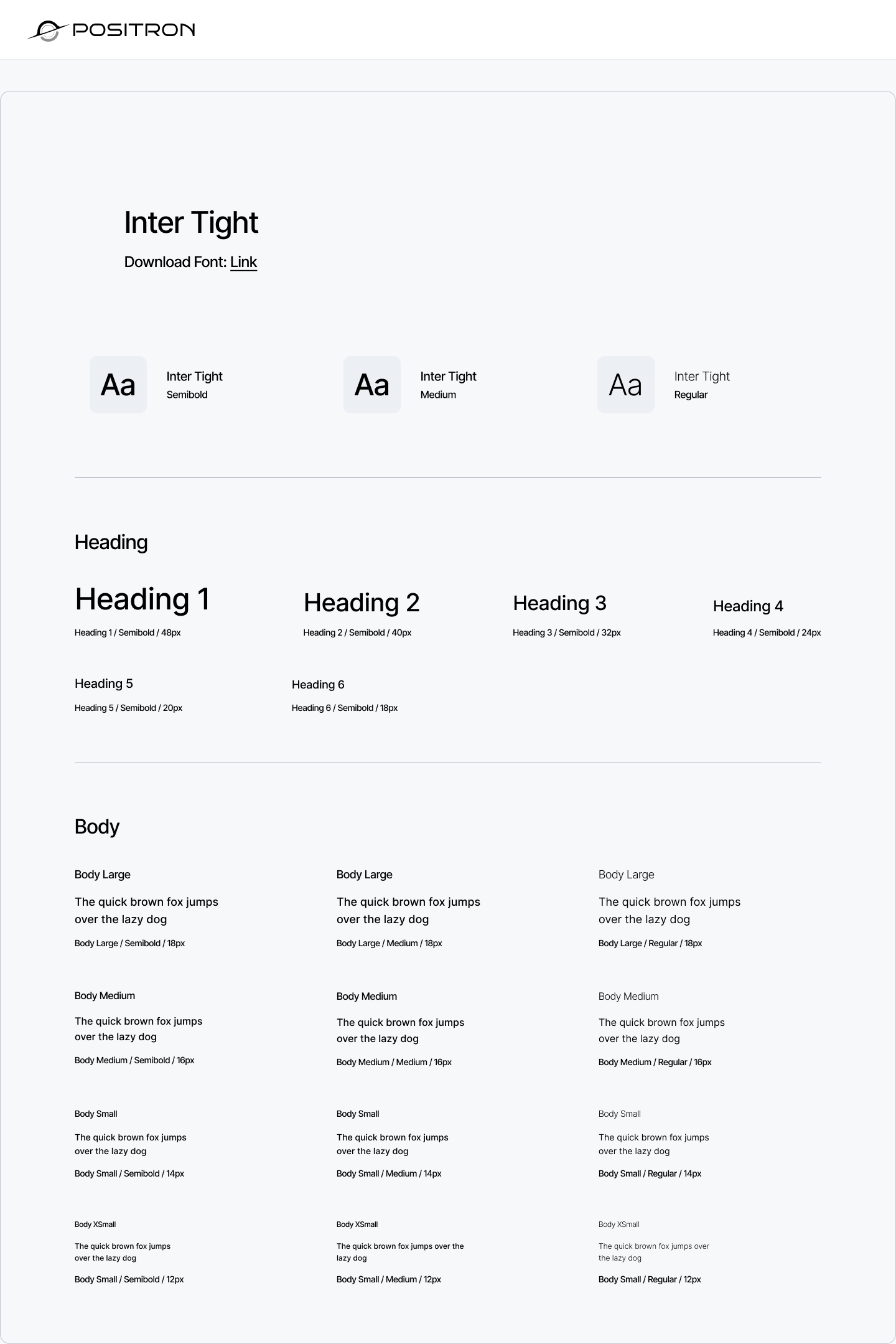
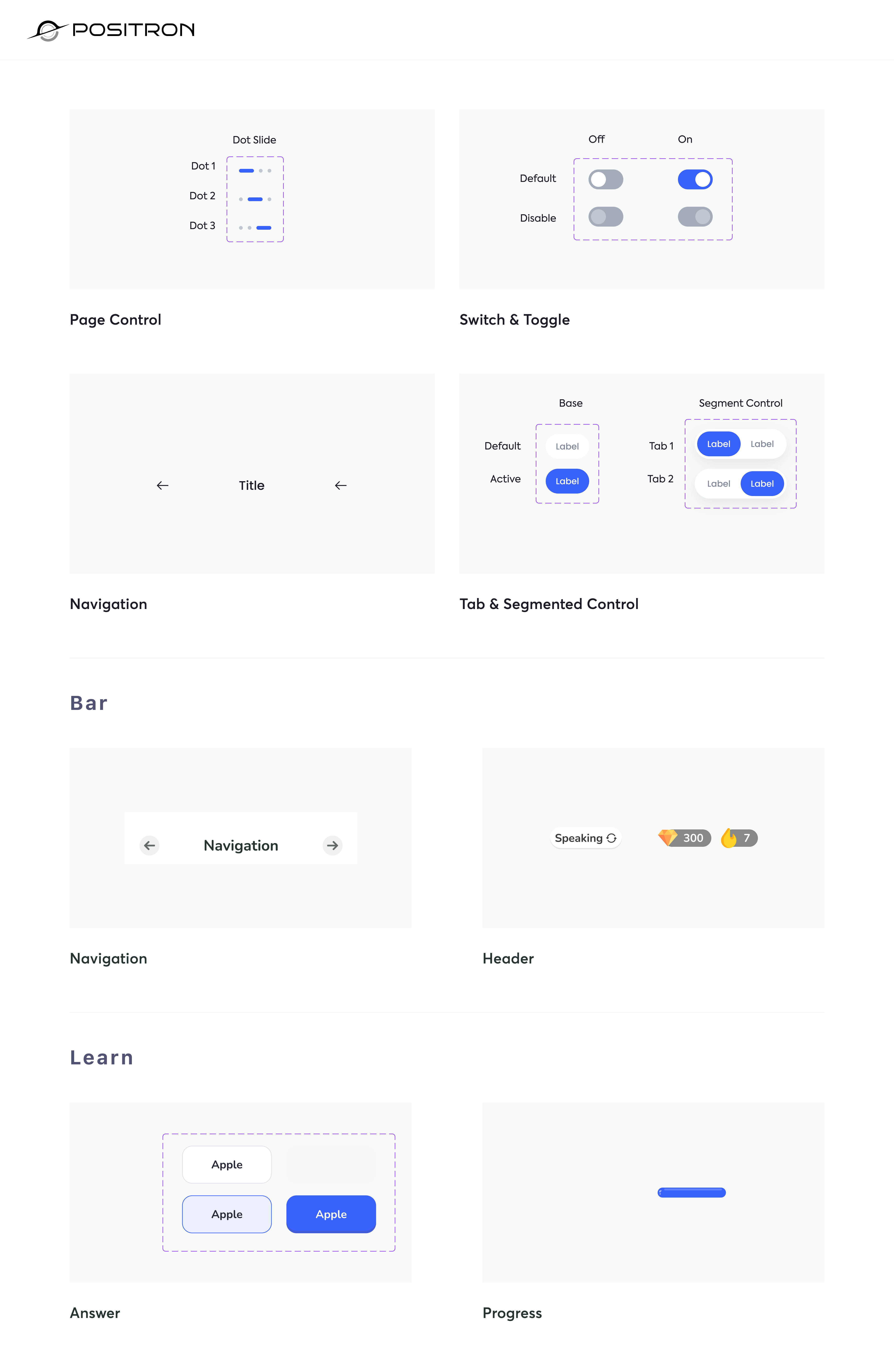
Design system
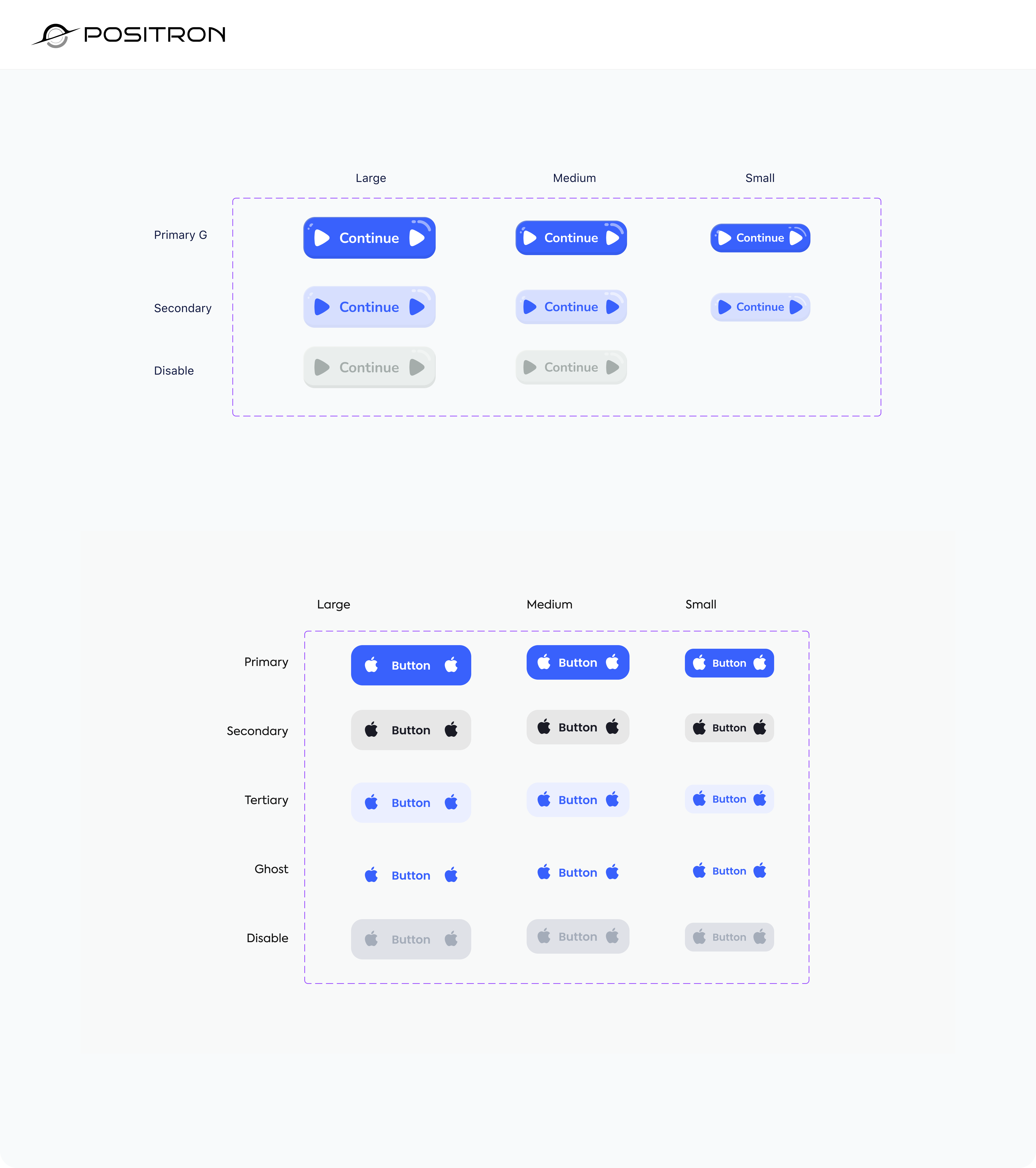
Visual identity
Mr. Lingo himself does a lot of the work — his reactions (proud, surprised, tired, encouraging) carry the emotional state of the session. Backgrounds shift by location to give the world progression visual weight.
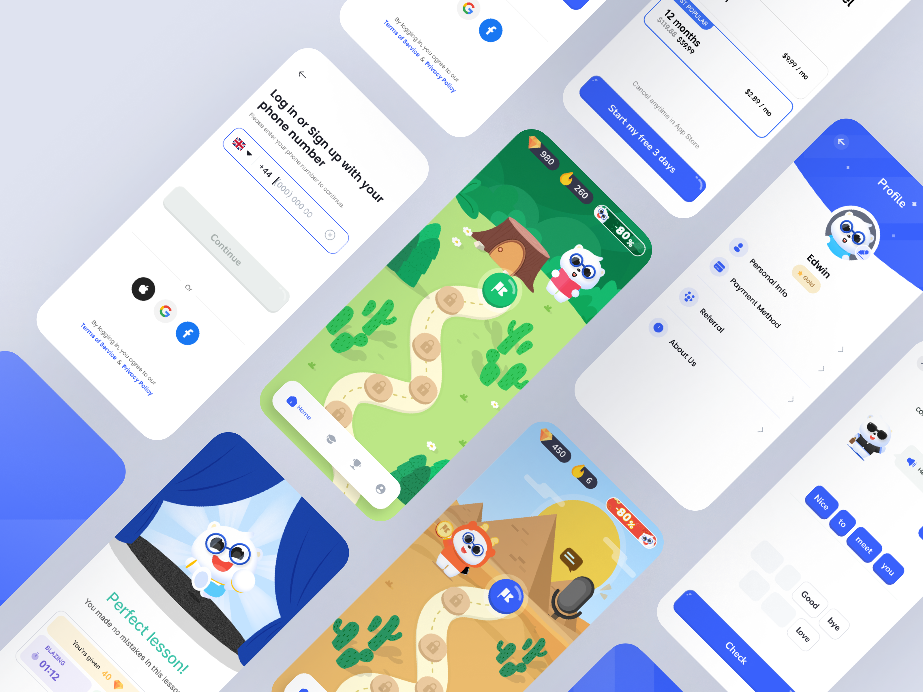
Screens
Reflection
- 01A joyful UX retains better than a utilitarian one. Emotion is the retention loop.
- 02Visual storytelling carries kids further than instruction. Show the world; let them learn inside it.
- 03Mascot + reward + rhythm = habit. Three small systems doing one big job.
Next: social leaderboards, a richer mascot reaction set, and MVP onboarding data to find where the next 20% of churn actually happens.