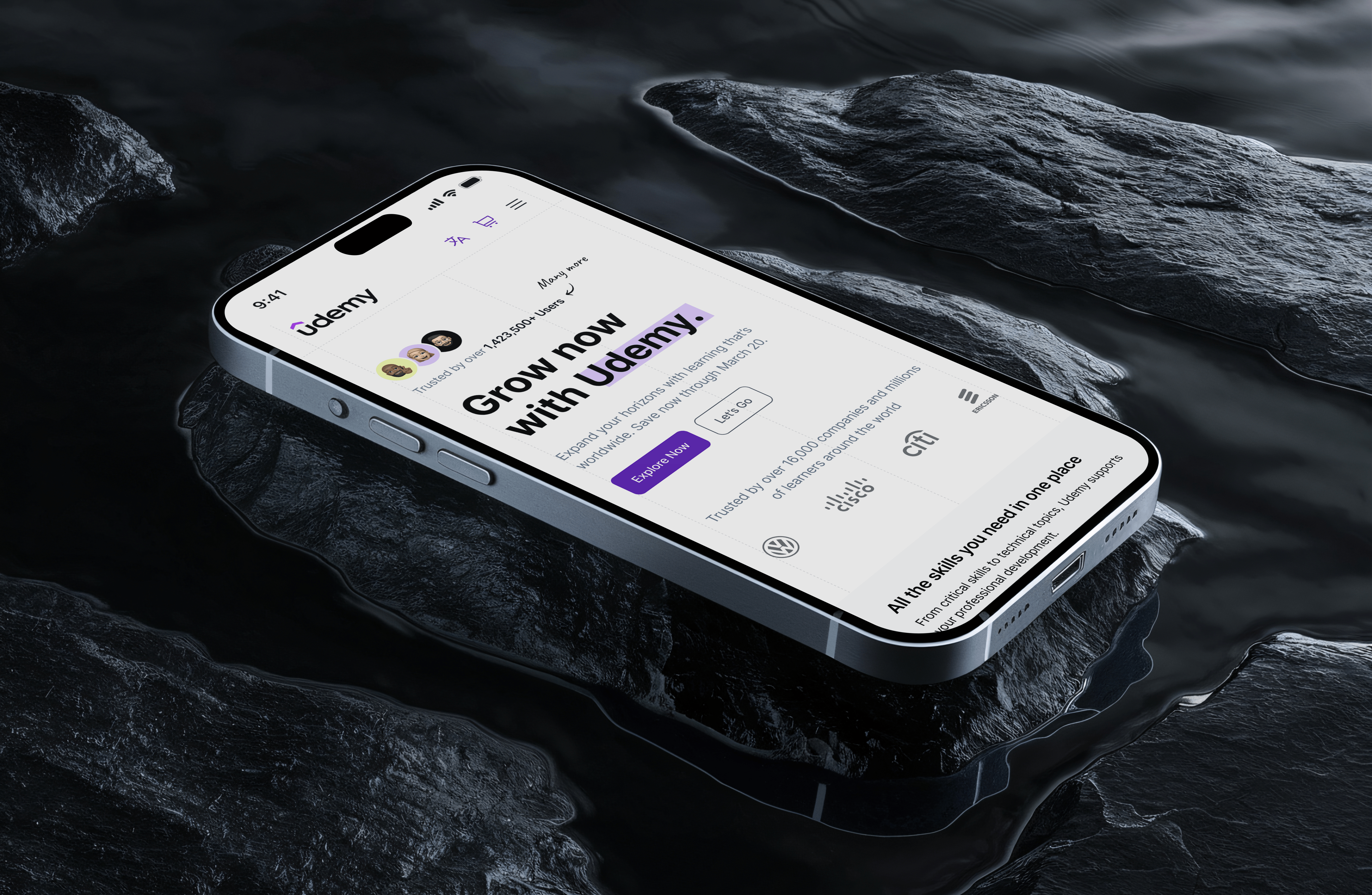
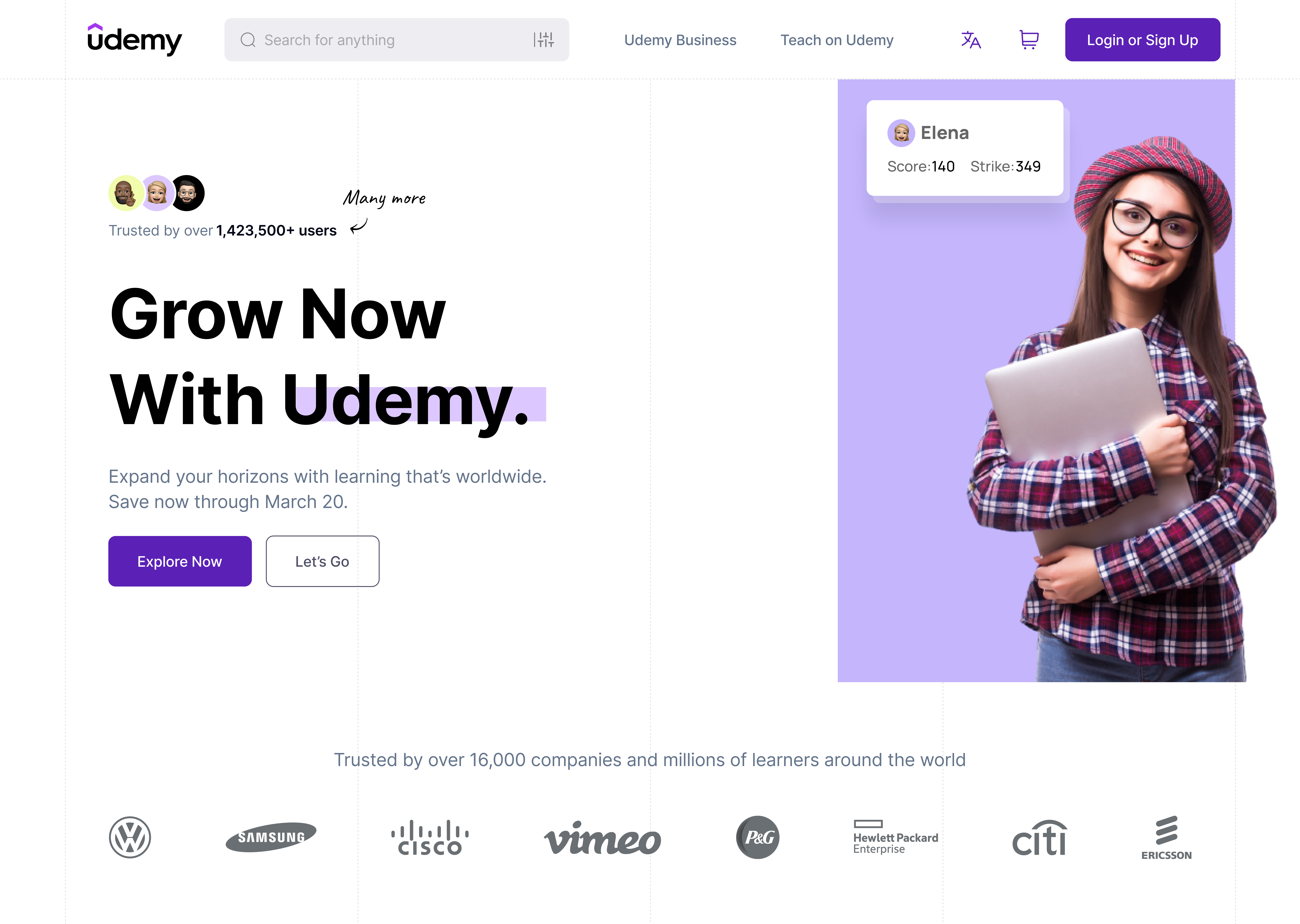
Udemy
A redesign exploration of Udemy's discovery experience — focused on making course choice easier instead of dressing up the page that already exists.
| Year | 2025 |
| Focus | IA, discovery, visual modernization |
| Type | Concept redesign |
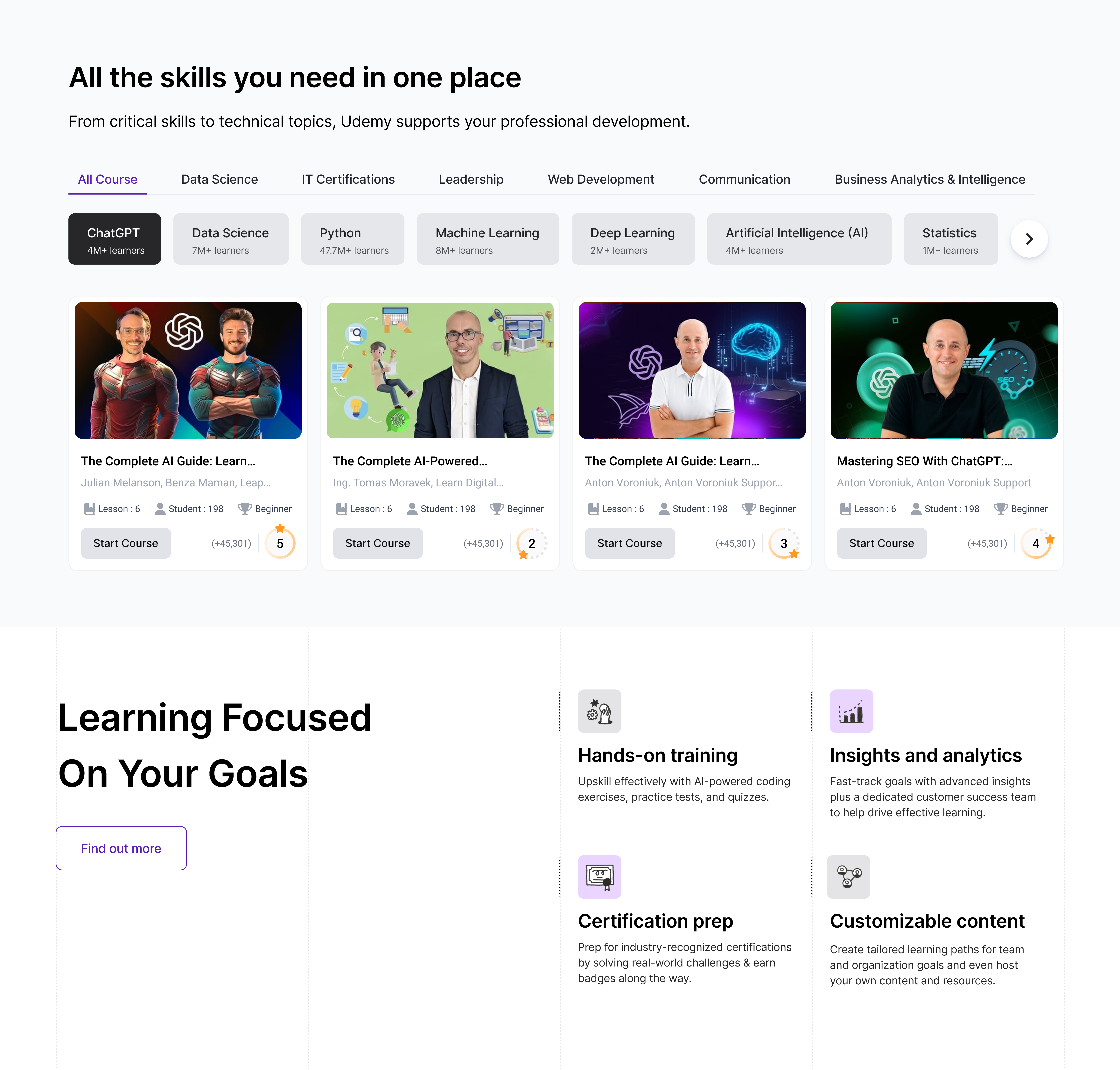
The real question
The hardest part of a learning platform isn't access to courses — it's helping the user pick the right one. Old Udemy buried discovery under dense navigation, weak hierarchy, and visual noise.
Three shifts that did the work
Simplified UI
Restructured navigation to lower cognitive load. Fewer paths, clearer destinations.
Better readability
Typography, spacing, and content hierarchy tuned for scanning, not skimming.
Modern visuals
Refreshed color, icons, and components — cohesive across the discovery journey.
Trade-off that shaped the redesign
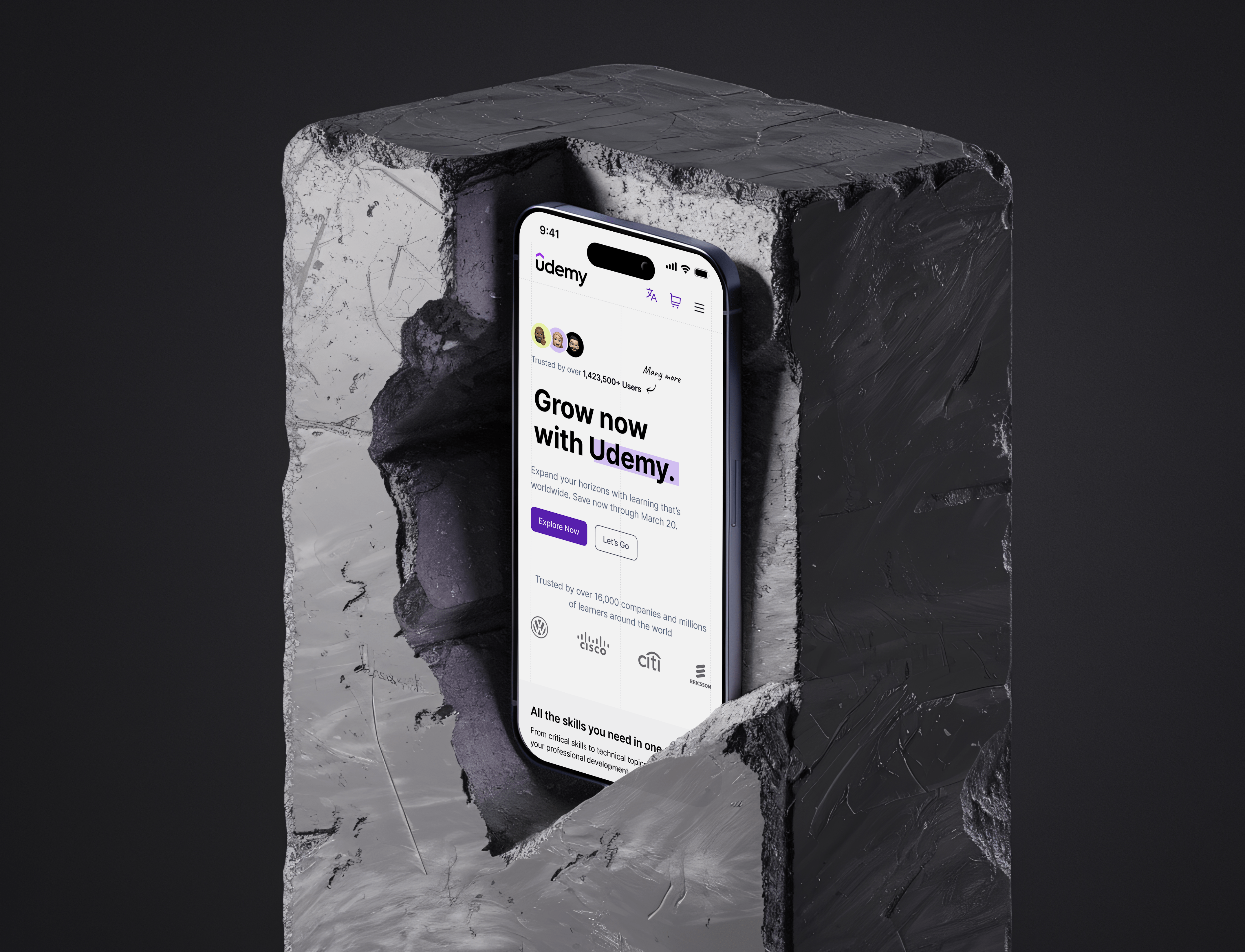
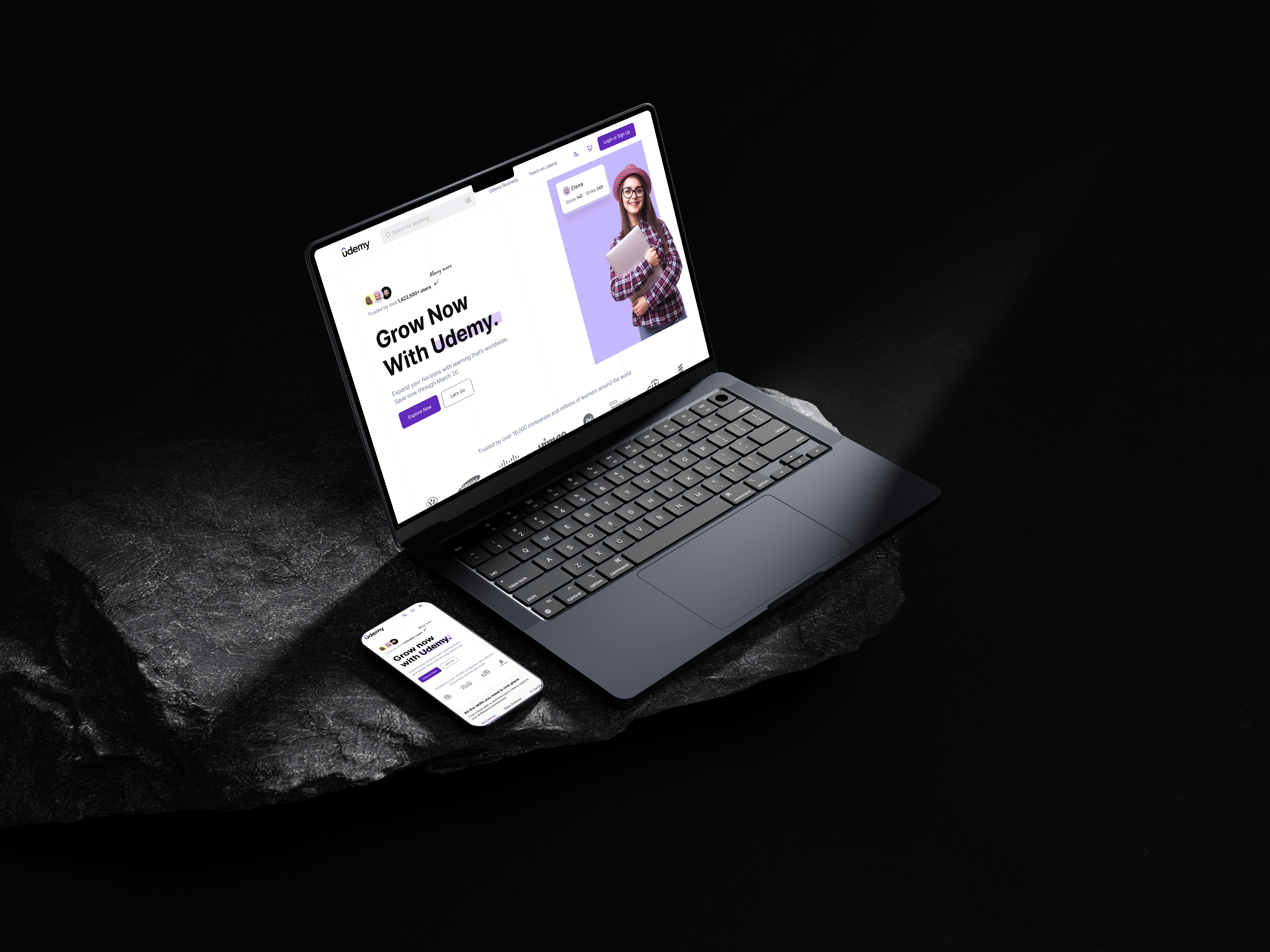
Screens
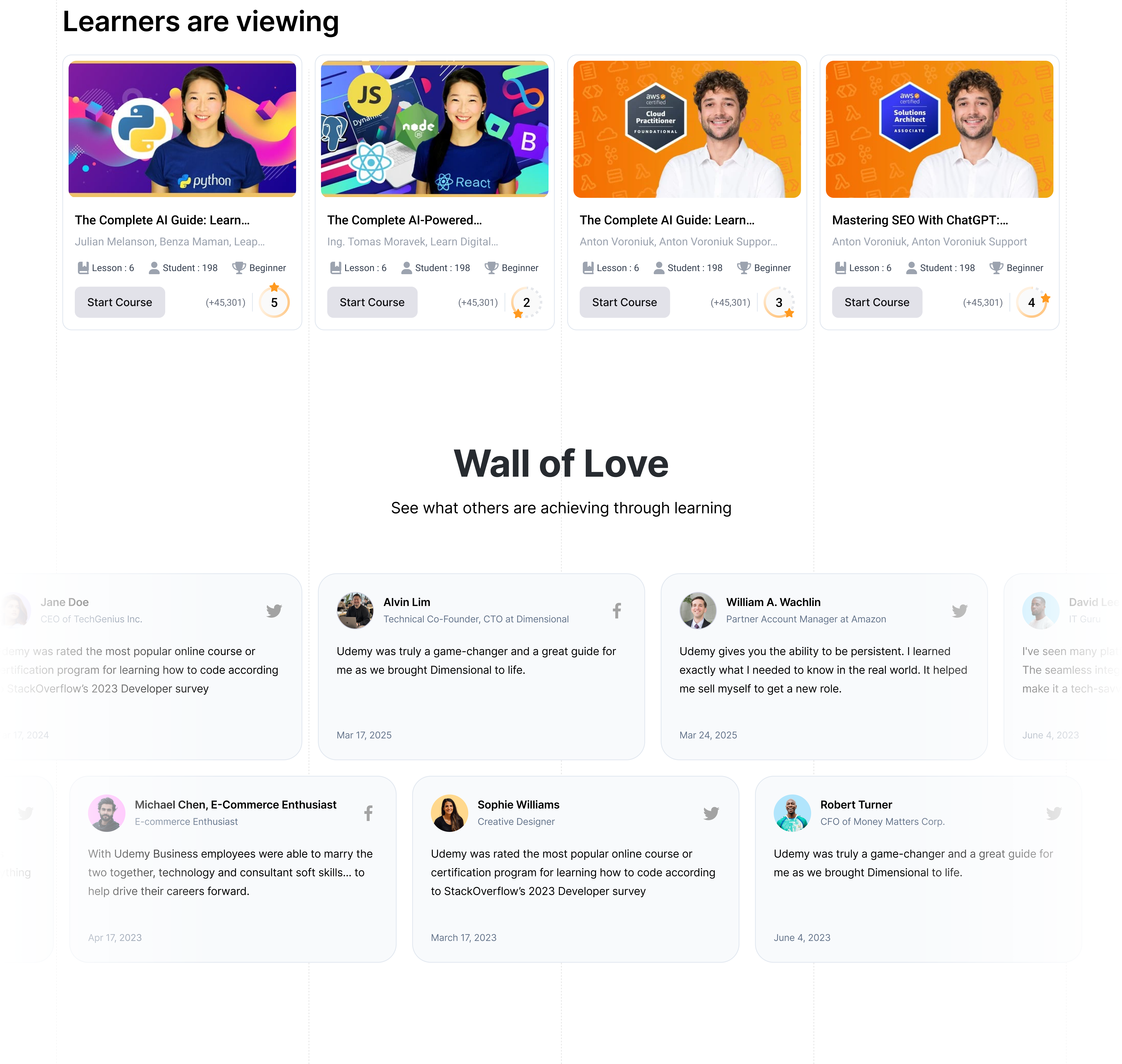
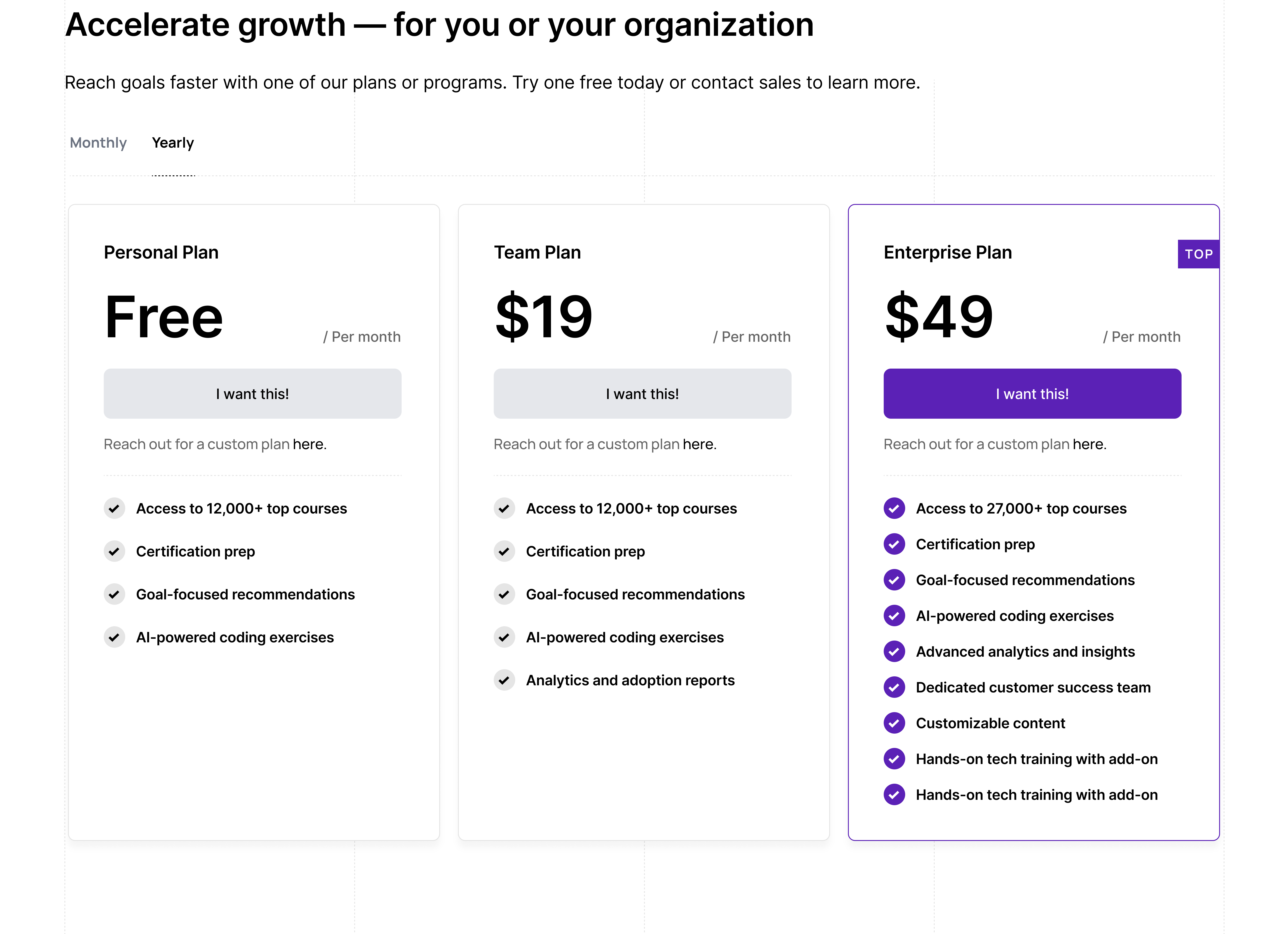
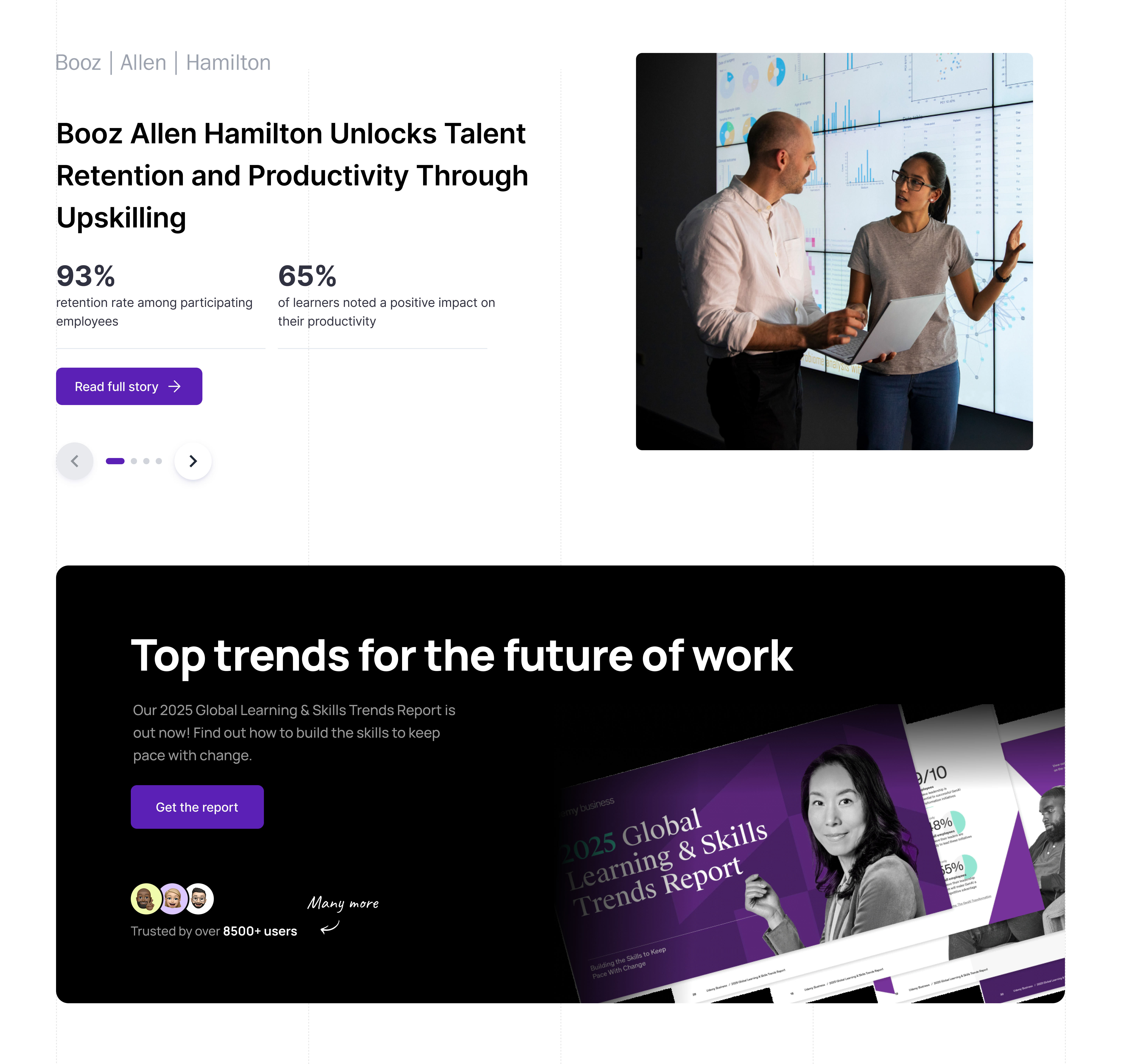
Experience refinements
Interaction patterns were tuned for the everyday loop: explore courses, track progress, stay motivated. The result reads as more immersive — fewer distractions, faster scanning, clearer commitments.